TRIAL PREPARATION SERIES | PART THREE of THREE
A looming trial or hearing date is no reason to panic. As we have described in PART 1 and PART 2 of our blog series, if your trial team has kept a well-organized and thoughtful document review and deposition process, your trial preparations and courtroom presentation should come together naturally.
The key to making impactful trial presentations and graphics is not necessarily doing anything novel, but creating a cadence and drawing attention to the key points you’re trying to make. Your review team should have identified most of your key points when reviewing evidence. Organize it so that the most important and clear-cut examples can be easily found by the trial team, ensuring a cohesive courtroom presentation.
You must relate the most compelling story possible when your matter is tried in front of a judge, panel, or jury. Here’s how to do it.
★ In Trial Presentation, Simple Is Better
Above all, keep your courtroom presentation simple. Even if you have uncovered a mountain of damning evidence, your job in presenting your case is to tell a simple and clear story. When presenting, don’t overwhelm your audience and don’t die by bullet point. The less clutter on a slide, the more memorable your language and imagery, the more powerful the message will be.
Once ESI has been reviewed for relevance, only a few key pieces or passages might actually be presented at a deposition, hearing, or trial. Consider how you’re organizing your courtroom presentation.
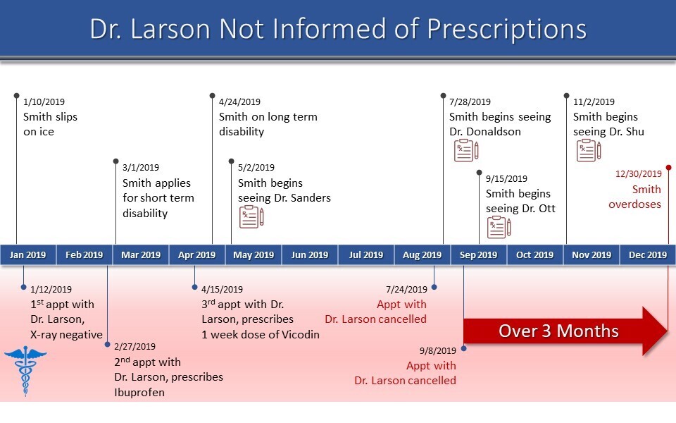
The bullet points you use should be descriptive but succinct. Your timeline should be clear and easy to understand. Use charts, quotes and visual images to draw the viewer in and tell your story, not just illustrate a chronology. As discussed in our Taking Depositions post, a timeline not only organizes your evidence, but helps find patterns to define and accentuate your story for a compelling courtroom presentation.
★ Timelines in Trial Presentation
To ensure your courtroom presentation is on point, use analytics to see date ranges and help determine your starting and ending points. Metadata can sort evidence by date so that you can organize it in a timeline view and can see patterns over time.
These timelines are functional, but they can also be given to a professional graphic designer who can create a simplified, polished timeline slide for presenting in court. (Reach out to Nextpoint for help with your trial graphics.)
Once your trial team and creative team understand key themes, the timeline becomes a roadmap or case brief. It will help set the stage for the audience and identify your cast of characters. Just like a good novel, consider the conflicts. Consider the rising action that brought conflict in the case. Then help lead the audience to a logical conclusion.
One of the most difficult questions is how to manage complex electronic data. Data is an important part of most litigation today. The aim is to create custom graphics to complement the data and make it more digestible for a judge, arbitration panel, or jury to follow.
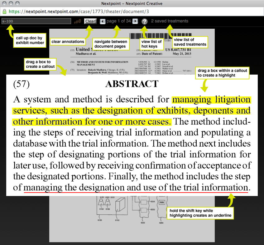
Alternatively, you can employ a true exhibit presentation platform (such as Nextpoint, Trial Director or OnCue) to present data using callouts to make the data or financial information easily comprehensible.
★ The Tools of the Trial Presentation Trade
As you receive designations from opposing counsel, organize them side by side with yours. In Nextpoint, reporting features allow you to discover what designations have been made. You can also see if there are any discrepancies and any objections you might raise. Issue tagging and coding in review will help make your key points and themes clear. We pointed that out in our recent post on trial preparation.
In addition, you can view designation types and search across all depositions easily. This means information can rise to the top so you can have a vertical view to leverage transcripts of depositions for an organized courtroom presentation. This is especially useful for MDLs or large scale litigation which may involve depositions and evidence from other jurisdictions or matters.
If you’ve done this work ahead of time, creating final exhibits will be much easier. In fact, many of our clients will run presentations from their trial database. Simply call up documents and video as needed and replay important designations or clips.
Callouts make great visuals. But professional designers or a good slide template can make even more powerful presentation materials.
Modern trial databases are great tools for organizing and presenting your case. But we also believe in old-fashioned courtroom presentation materials. As courts go back to in-person meetings, a mixed media presentation should include digital exhibits on your presentation platform. You can also include a poster board that you can point to in the courtroom or arbitration room to hammer home important points.
★ Want to Learn More?
Check out Parts 1 and 2 of our Trial Preparation Series:
-
- Trial Preparation 101: Strategies for Building Winning Arguments outlines the strategic aspects of trial planning
- Taking Depositions: Preparation Strategies for Attorneys explains how to get the most out of your depositions and manage them alongside the rest of your case
And download our comprehensive eGuides on case building and deposition prep
If you’re looking for help with your courtroom presentation or any part of the litigation process, please reach out to the experts at Nextpoint. We can help you create custom graphics for your presentation, provide assistance in person when you go to trial, and so much more.


