At Nextpoint, we understand that it is crucial for ediscovery and litigation tools to be as fast and cost-effective as possible. To that end, we periodically introduce a major enhancements, like our review metrics designed to help you track and monitor the progress of your review. But we are also continually tweaking our interface in response to customer requests to make sure it works the way they do.
GridView for document review workflows
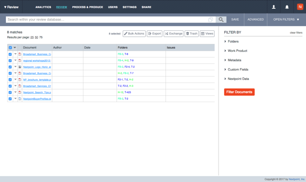
Today, we’re proud to introduce a new and improved Grid View, our streamlined interface for browsing your documents. We have already introduced a number of new features in Grid View to make it more customizable. Now we have even more resizing options, including a new feature to save the custom views for individual reviewers.
In the past, a reviewer might resize their grid view to allow them to quickly scan the information most important to them. Now, those changes are automatically saved, so that each reviewer can preserve their custom column widths and other choices as they move through their review.
It’s just one small way we’re trying to help reviewers quickly scan and precess information they need for a case.
For example, in the Grid View layout above, users can choose to change, resize and manipulate any of the columns, a process which is now smoother than ever.
In addition, all of our Nextpoint applications will remember those choices and display the same column widths and layout on every page of search results that reviewer looks at. As always, comments and feedback are highly welcomed and encouraged.


